Population Patterns in US cities
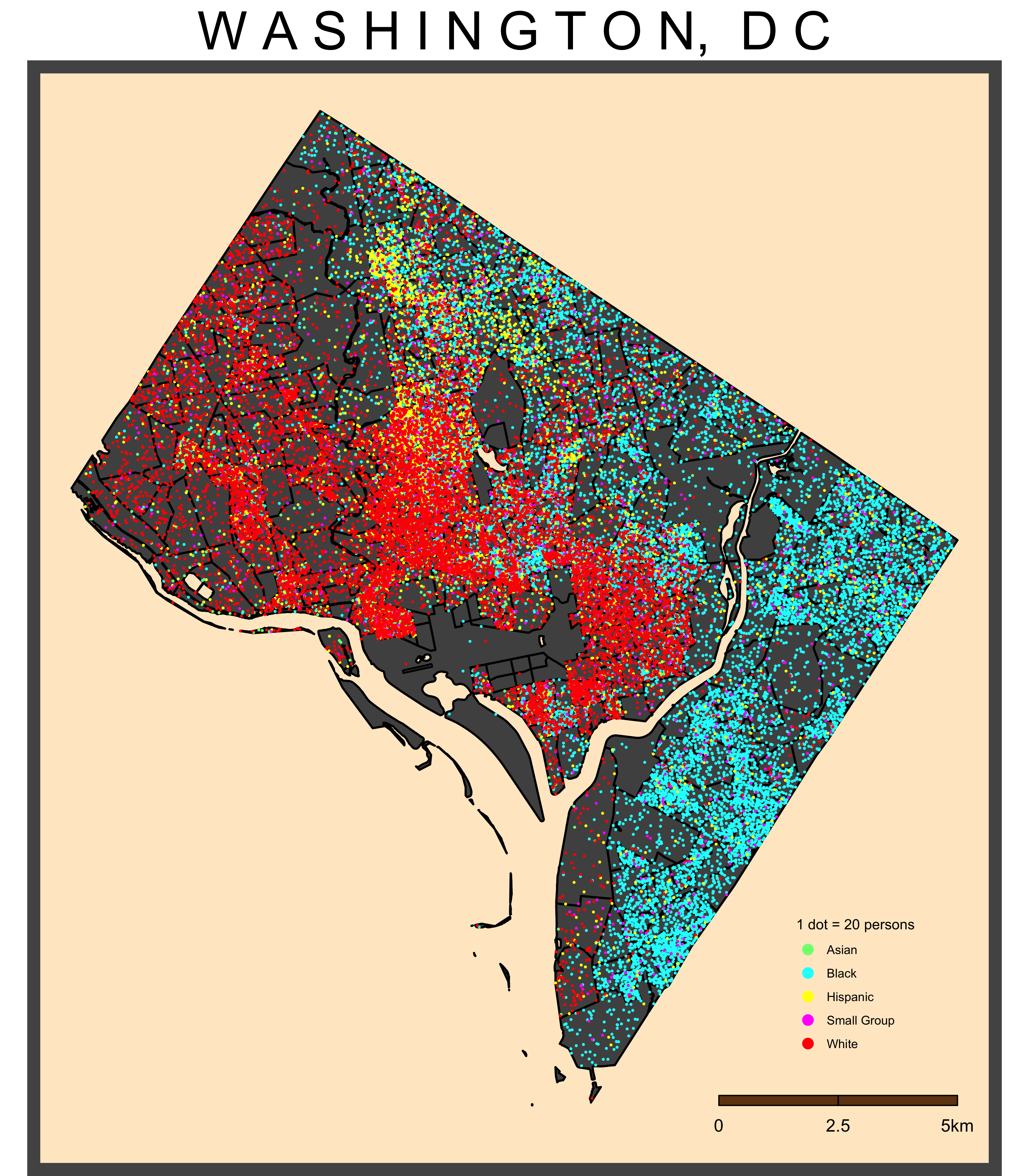
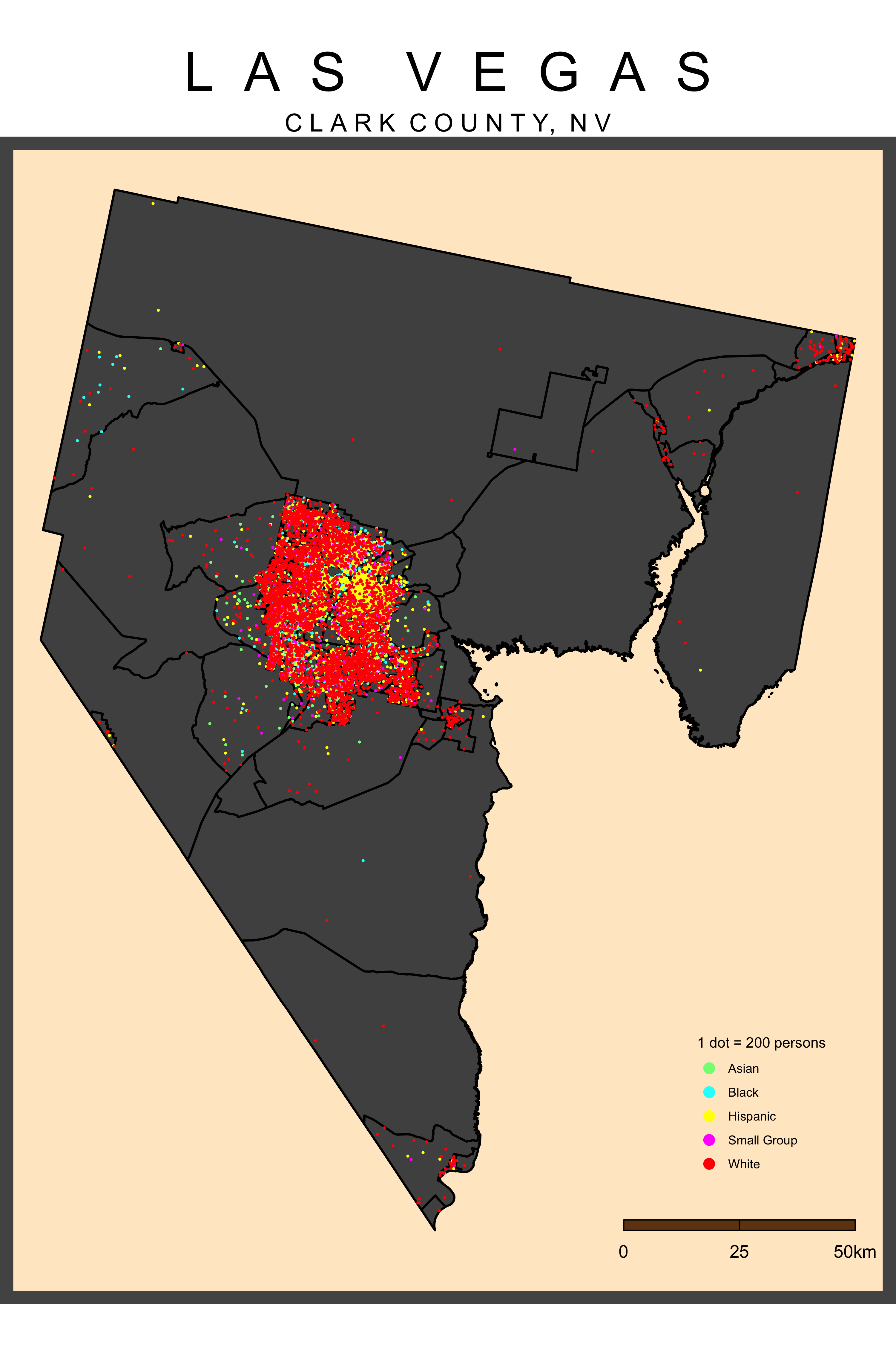
I wanted to map the general populations of major metropolitan areas across the US. Using Walker's TidyCensus package within RStudio, I've produced several dot density maps to project the demographic patterns of some of the biggest cities in the country. The purpose of these maps is to visualize the social formations of metropolitan areas and to illustrate the general trends in clustering and dispersal of the population.
I've projected most of the maps at the County level to include the populous downtown area along with the more sparsely populated urban periphery, although several focus on the distinct city boundaries. Each map includes the four major racial/ethnic groups, while those identifying as Native American, Hawaiian and Pacific Islander, and two or more races were pooled together in order to create a visualizable total. The data is aggregated to the block group level within the County boundary and is sourced from the 2020 P2 Census dataset. I should also note that the legend differs on each map, rather than having a consistent dot total throughout the series, in order to illustrate meaningful patterns in each individual city.
Northeast
Midwest
Northwest
Southwest
Southeast
References
Walker, K. (2023). Analyzing US Census Data: Methods, Maps, and Models in R (1st ed.). CRC Press.


Comments
Post a Comment