COVID-19 in England and Wales
This chapter illustrates my work on the geography of COVID-19 in England and Wales. Using data sourced from the Office for National Statistics and Our World in Data, I have generated a few maps on the locational variations in deaths from COVID-19 and also total cases.
My initial projection shows the overall cases of COVID-19 in the UK throughout 2000 and 2022. Made in RStudio using the code generated by Ansgar Wolsing, the graphic shows the seven-day average and it is weighted heavily in the time periods where the UK has experienced the highest numbers of cases.


The density equalizing cartogram furthers this analysis by calculating the ratio between the deaths by COVID-19 and the size of the region. This calculation hugely distorts Greater London and projects the region as the largest polygon on the map. This is because Greater London is the smallest region in England and Wales by area, but it demonstrates the highest deaths by COVID-19.
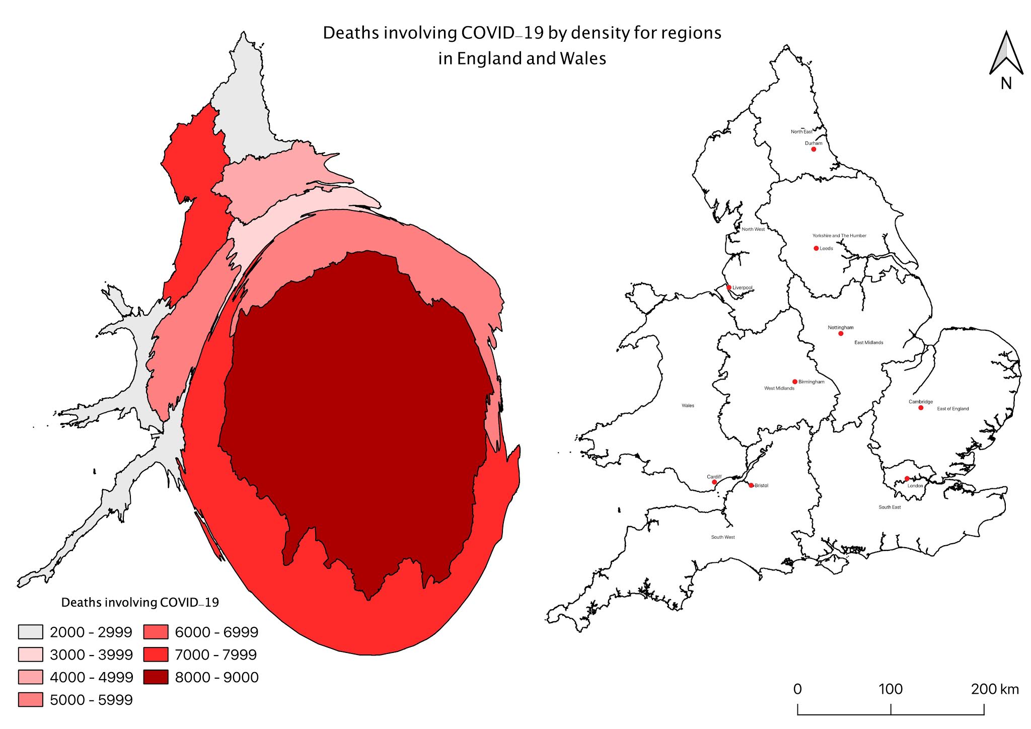
My next few maps take choropleth form to highlight the number of deaths in each local authority between March and July 2020. I chose eight classifications for each map with specific reference to the local authorities without any deaths.


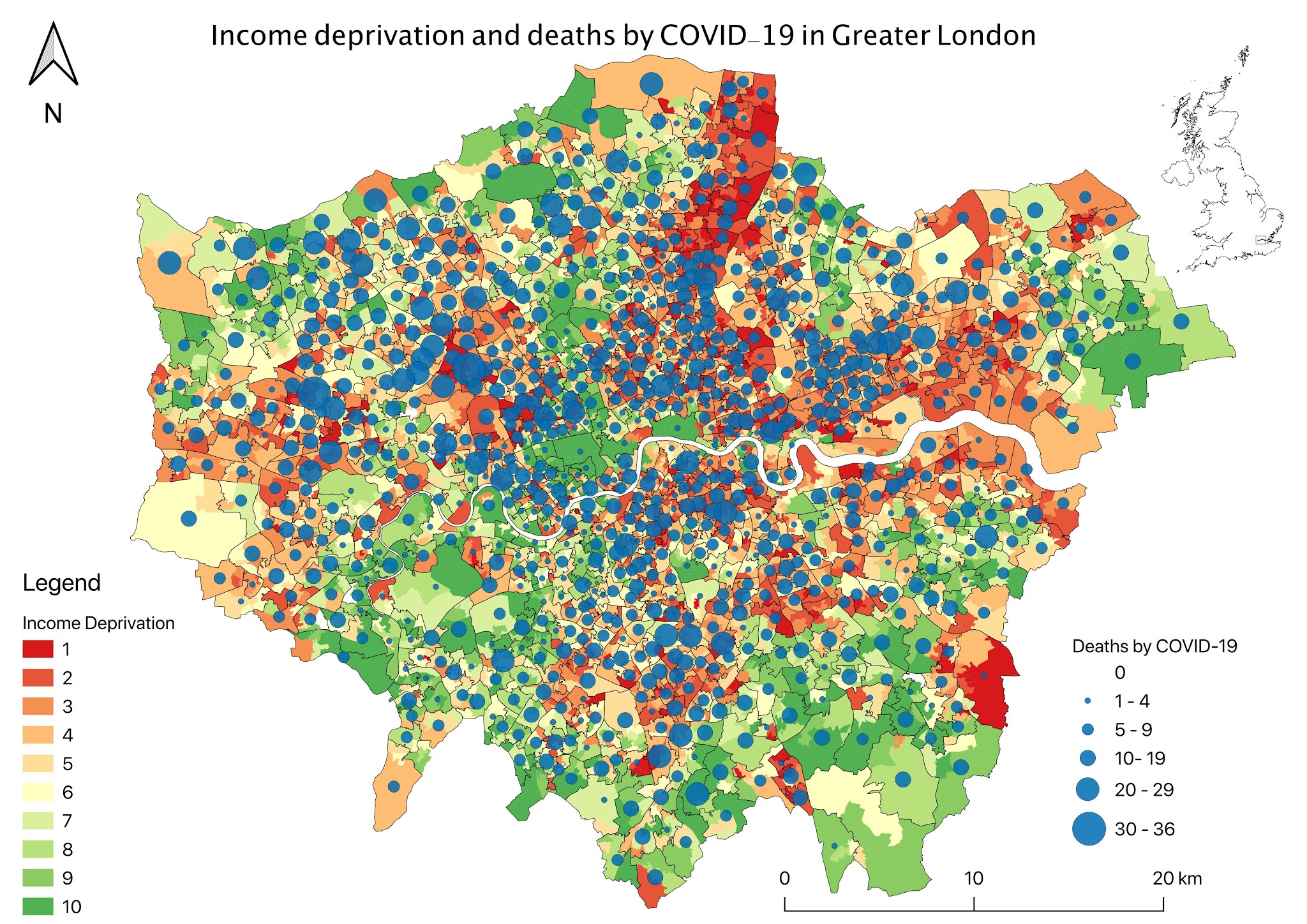
In the next few chapters, I have taken a closer look at a number of areas in England. My initial maps are in choropleth form with gradual point data overlaid as a bivariate analysis. The data in choropleth form highlights the average IMD rank for the Lower Super Output Areas in that borough, with a lower ranked borough representing greater deprivation and poverty. Deaths by COVID-19 is illustrated as a gradual point symbol to show how each borough has been impacted by the pandemic.
Greater London

The following maps identify statistics on a Lower Super Output Area scale to illustrate more general trends across neighborhoods in Greater London. The IMD decile shows that areas with greater levels of poverty and deprivation are ranked with a lower number and shaded in a red colour. Below this, income deprivation refers to individuals who experience deprivation through low income and lack of employment.

Liverpool City Region


The quality of housing is determined by using the Indoors Sub-domain decile which measures the indoor living environment across LSOAs. Initial trends show that areas with lower quality housing, such as north Sefton and north Liverpool, have a greater number of deaths by COVID-19 whereas areas in east Halton and north St. Helens represent higher quality housing and fewer COVID-19 deaths.

A closer look at the northern area of Sefton, and specifically the town of Southport, can be found below. These depictions relate the COVID statistics to average annual income, IMD Decile, and the location of greenspace.


Comments
Post a Comment